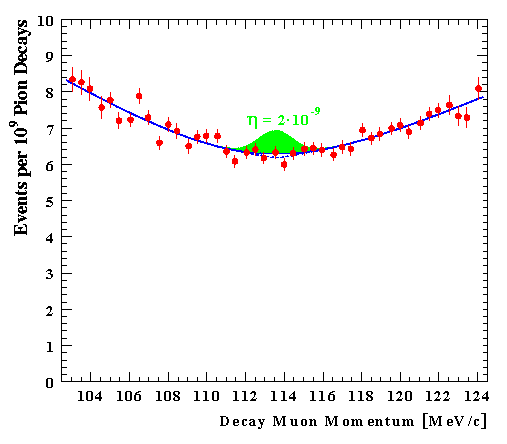
Figure 6: A sample of the 1999 data is fitted with a gaussian(red dashed line) added to a hyperbola (red solid line). The blue dashed line shows the expected peak for h < 2.5 · 10-9.